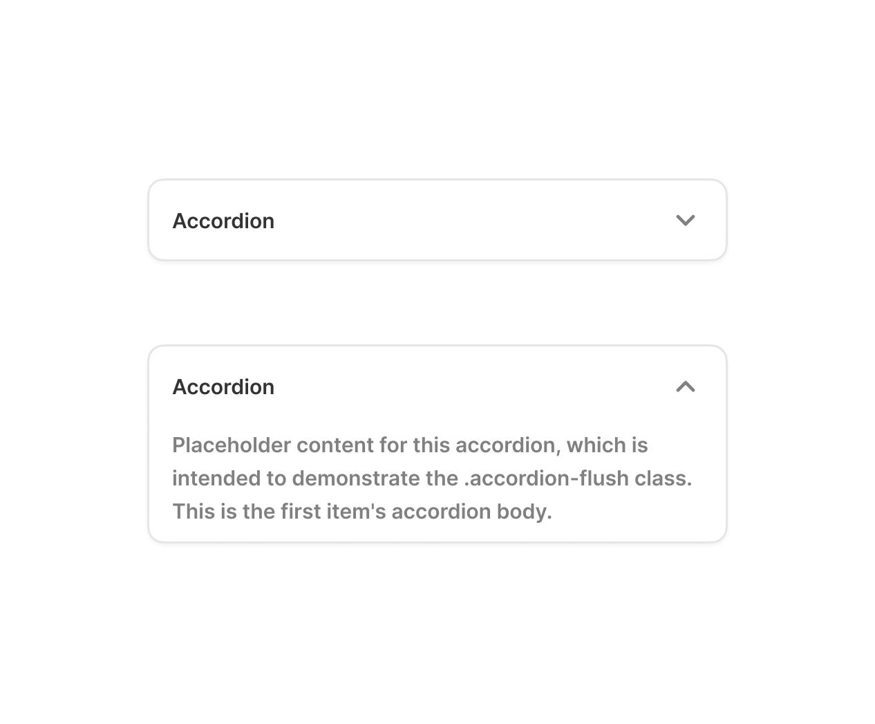

Accordion components for Figma help designers present large amounts of content in a structured and user-friendly format. These interactive UI elements allow sections of information to expand and collapse, making interfaces cleaner and easier to navigate.
Our Figma accordion components are fully customizable and designed for modern UI/UX workflows. They are ideal for FAQs, settings panels, product descriptions, dashboards, and mobile interfaces. Each component is built using Figma auto-layout and variants, allowing designers to quickly adjust spacing, typography, icons, and states.
Whether you’re building a design system or creating a responsive interface, these accordion components help maintain consistency while saving time in the design process.
Features:
- Fully editable Figma components
- Built with Auto Layout and Variants
- Expand / collapse interaction states